
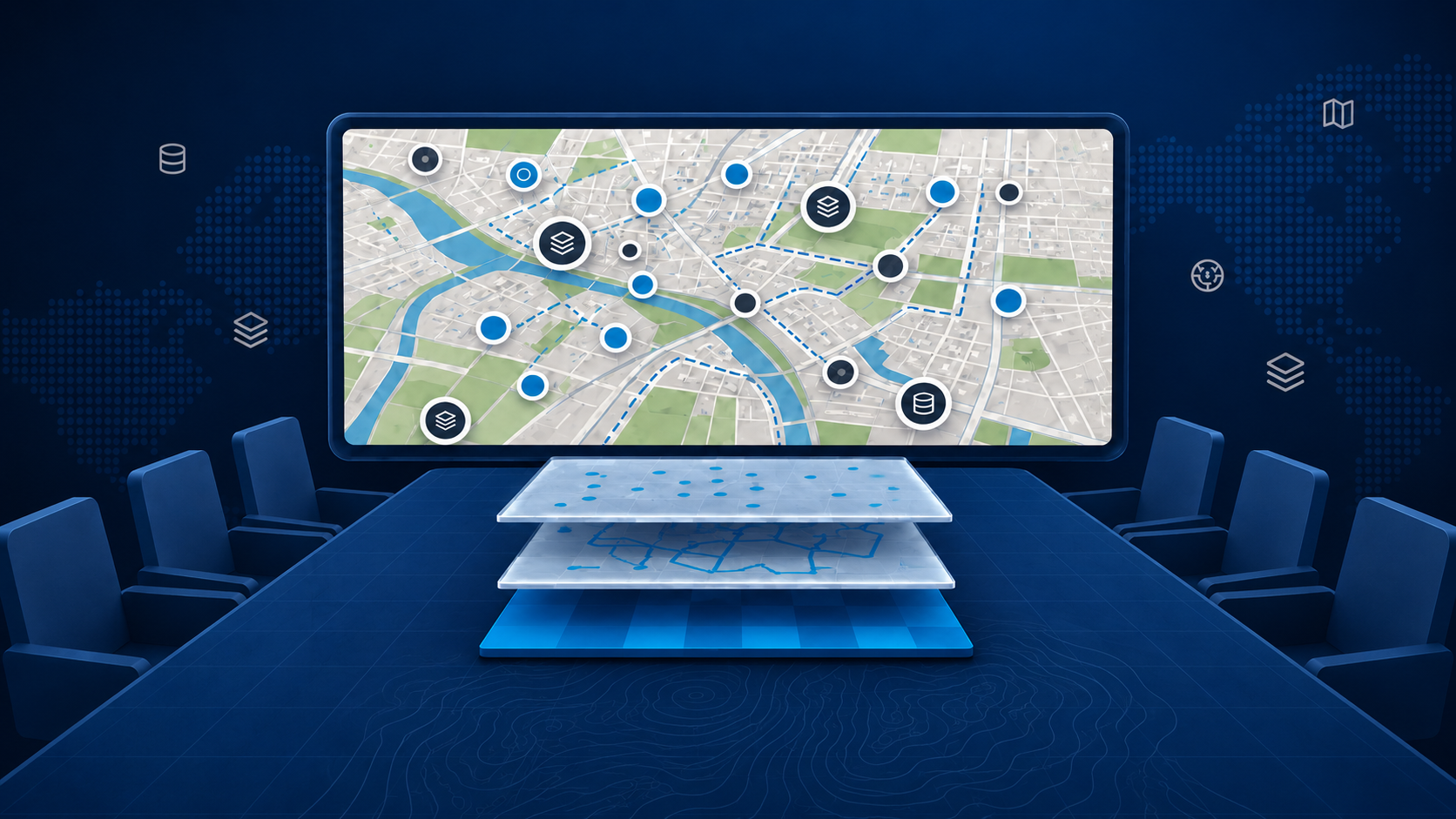
Your team has collected the data, configured the layers and prepared an interactive map. Then someone opens it and asks: “Where should I look?”
For a GIS specialist, the answer may seem obvious. They know which layers matter, how the filters work and what the colours represent. Colleagues, residents and decision-makers may see the same screen and struggle to find a starting point.
Making information available is only part of the task. To communicate it clearly, you also need to help people understand what they are looking at and why it matters.
A map presentation provides that structure. With an appropriate GeoApps application, prepared views and explanations linked to locations, you can guide people through the information they need.
Start with what matters to the person opening the map
Different audiences bring different questions. A resident may want to understand a proposed change near their home. A decision-maker may need an overview of options and consequences. A project team may require detailed information about planning, phasing or related work.
Therefore, start by defining who the map is for and what it should help them understand or do. This gives you a basis for choosing the opening view, the level of detail and the explanations.
For example, a presentation about a street redesign could begin with the project area, introduce the proposed changes and then explain access during construction. Technical information can remain available for users who need to investigate further.
Not every dataset needs to appear immediately. A clear starting point helps people find their way before you introduce additional detail.

Choose an experience that helps your audience follow along
A GeoApps Viewer suits users who want to search, filter and explore information independently. However, communication and participation may benefit from a more guided format.
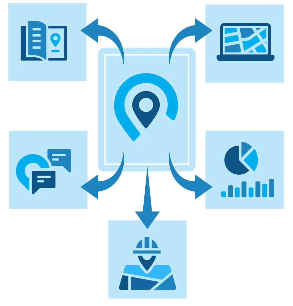
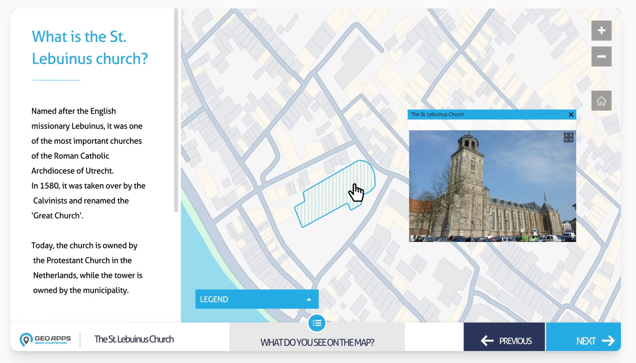
MapTour can lead users through a sequence of locations with supporting explanations. A Dashboard can bring maps together with figures and summaries. MapTalk can connect spatial information with questions, ideas and feedback.
The right choice depends on the purpose. Are users investigating a question, following a project explanation, reviewing indicators or contributing local knowledge? Each task calls for a different balance between guidance and independent exploration.
Consequently, choosing the application format is also a communication decision. It shapes how people encounter the information and what they can do next.
Give people a clear route through complex information
A map with many layers can be useful for analysis, but difficult to interpret at first glance. Prepared views help divide the information into manageable steps.
A view is a predefined perspective on the map, with an appropriate location, zoom level and selection of layers. One view might introduce the project area, another explain the implementation phases, and a third show access routes.
This means users do not have to discover every setting themselves. The relevant information is already arranged in a logical sequence, allowing them to focus on the subject.
For example, a project presentation could move from an area overview to proposed interventions and then to locations where feedback is requested. Each view should answer a recognisable question and make its relationship to the previous step clear.
Meanwhile, consistent legends, labels and styles help people interpret the information as they progress. Explain unfamiliar indicators before asking users to draw conclusions from them.
Put the explanation beside the place it describes
Spatial information becomes easier to understand when the supporting explanation appears where it is needed. Short texts, photographs, videos, documents and links can provide context for a location or view.
For example, a photograph can illustrate existing conditions, while a short description explains a proposal. A link can give users access to supporting documentation without filling the main presentation with technical detail.
Also distinguish between recorded conditions, modelled estimates and proposed changes. Where the source, date or limitations affect interpretation, include that information in the explanation.
GeoApps applications such as MapTour, Dashboard and MapTalk offer different ways to organise maps and supporting content. This allows specialists to prepare a clear experience while retaining responsibility for the underlying information.
Finally, ask someone unfamiliar with the map to try it. Can they identify the main message? Do they understand the legend? Is the next step clear? Their questions can reveal where the presentation needs more guidance.
Make your maps easier to understand with GeoApps
A useful map presentation helps the right people understand the information and take the next step. Start with their questions, choose a suitable application, prepare clear views and add context at the relevant locations.
Would you like to make your spatial information more accessible to colleagues, residents or decision-makers?
Contact the GeoApps team to discuss guided map presentations, dashboards and interactive communication.