
Mapping green: how the municipality of Hengelo makes its green balance visible
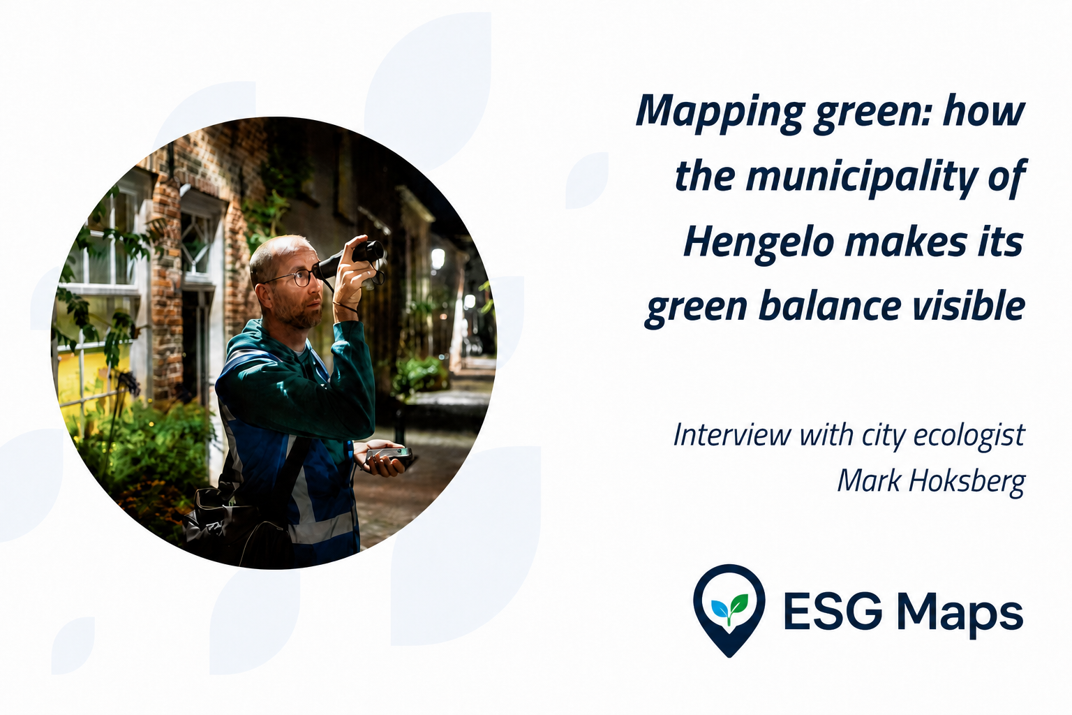
The Dutch municipality of Hengelo shows how spatial data can help cities understand how urban green is distributed and how it changes over time.
The Dutch municipality of Hengelo shows how spatial data can help cities understand how urban green is distributed and how it changes over time.
With the new urban green analysis, Hengelo gets a grip on its green balance
The analysis gives Hengelo a picture of urban green that many municipalities still lack, so choices are often based on assumptions. In Hengelo that picture became concrete for the first time — down to neighbourhood level.
The approach used in Hengelo is increasingly relevant as European cities place more focus on measurable urban green and long-term monitoring. It was built to compare neighbourhoods, track tree canopy cover and urban green, and see where green increases or disappears — not as a legal compliance exercise.
City ecologist or data analyst?
Balancing building and greening
“My work is about greening and strengthening biodiversity,” says Mark Hoksberg. “Not only because we have to comply with European legislation, but above all because we want to improve liveability across Hengelo. Trees play a key role: they reduce heat stress, help with waterlogging and contribute to residents’ health.”
The task is still complex. Like many cities, Hengelo faces a substantial housing challenge.
“Building inside the existing city requires smart choices. On the one hand we have to add homes, often by going up with apartments. At the same time we want to keep enough urban green, or even expand it. That can mean planting trees that provide a lot of canopy rather than only shrubs or planters. Mobility also matters: the less space we need for cars, the more room there is for green in the city.”
The analysis: the balance of urban green
What prompted Hengelo’s urban green analysis?
Until recently nobody knew exactly how much urban green Hengelo was losing or gaining. Aerial photos are taken every year and show in detail where trees, shrubs and green strips are, but the overall picture was missing. At the same time several trends run through each other.
On the one hand, urban green is lost when people pave over gardens or when new-build projects land in the urban area. On the other, more residents are taking tiles out of their gardens, trees are growing larger, old business parks are turning into greener neighbourhoods, and greening projects and green roofs are appearing.
Only a complete picture of all those “green pixels” shows how much urban green actually remains. Distinguishing those pixels by owner — residents, housing associations or the municipality — makes it clear where green is being gained and where it is going backwards.
The answer is the urban green analysis: an instrument that puts these developments into figures and makes the balance between gain and loss visible.
“Developers invest a lot in greening, but it was hard to see what that really delivered in the overall picture,” says Hoksberg. “With the new analysis we could draw up a concrete green balance for the first time.”
To do that, ESG Maps combined aerial photos supplied by the municipality from 2006, 2016 and 2022 with municipal geo data, manual checks and specialised remote-sensing analysis.
The result: a dashboard that makes trends visible, neighbourhood by neighbourhood.
Why ESG Maps?
“From my time at an ecological consultancy I knew there were opportunities with techniques such as remote sensing,” Hoksberg explains. “That is why I contacted ESG Maps. I already knew Egbert Griffioen from that period and knew they had built maps and dashboards before, for example around solar energy.
Egbert showed how we could approach this project: which data we needed and how we could present the results clearly. We collected and supplied the historic aerial photos. After a few iterations the data was refined further and ESG Maps processed it into a dashboard and viewer. The results are now visible for the whole municipality and per neighbourhood.”
How was the analysis done technically?
Urban green detection used aerial imagery with support from municipal geo files. Building and road datasets were used so the analysis focused on land where green could actually stand. An ownership map was added to distinguish municipal green, housing-association green and private green.
The results come together in the ESG Maps dashboard, where external datasets, municipal data and manual checks meet. That is how, for example, real urban green is distinguished from surfaces such as artificial turf or tennis courts.
Data quality depends on the resolution of the aerial photos, which has improved over the years. At square-metre detail the analysis remains somewhat coarse, but comparing different years makes the trends clearly visible.
The properties of the data also matter. Aerial photos are not taken at exactly the same moment each year, so seasonal differences can cause small deviations. That is why the years were deliberately selected from the same period.
Some effects are obvious: when a meadow makes way for a new neighbourhood, the analysis automatically shows a decrease in urban green.
Key insights
What were the main results of the analysis?
“The analysis shows that a large part of Hengelo’s neighbourhoods is, on balance, losing urban green. At the same time there are clear differences between parties. Private homeowners in Hengelo plant relatively more trees than housing associations, probably because they have their own garden and actively look after it. The municipality itself also contributes substantially with new planting.”
It is also clear that the neighbourhood boundary is a fairly arbitrary scale.
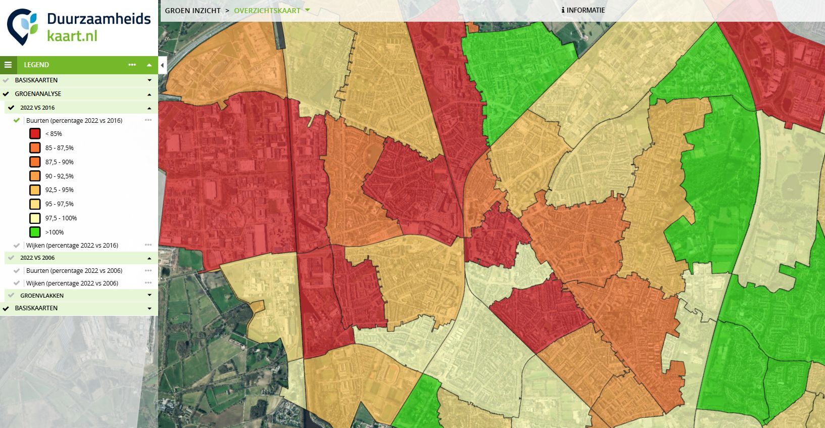
To tackle heat stress and improve liveability it is therefore important to eventually get insight at street level as well.
“That is where you actually feel whether there is enough green.”
How do you communicate insights like this with residents and stakeholders?
For now we are still cautious. We mainly use the insights internally, for example to support green policy. The maps and outcomes provide a solid basis for planning green infrastructure at scale. At the same time some outcomes speak for themselves: when a neighbourhood is built on a former meadow, it is logical that urban green disappears.
The instrument is meant to make trends visible, not to make claims to the square metre.
A disclaimer therefore remains important, even though we see it is often overlooked.
That is why the municipality will probably clean the maps further by hand, or publish an accessible version with extra explanation.
For now the maps are available internally; later residents will also be able to request the underlying datasets.
What are the next steps?
“We are taking the outcomes into our new green plan de Groene Koers, part of the Environmental Vision phase 4. The idea is to use this instrument for monitoring every five years, for example. For now it is mainly suited to large-scale insights, but there is a lot of potential in further refinement. Thanks to the rapid development of machine learning and object detection in remote sensing — and ever-better aerial photos — we expect accuracy to increase substantially in the coming years. That will eventually also give us a much more precise picture of the real green balance at neighbourhood and street level.”
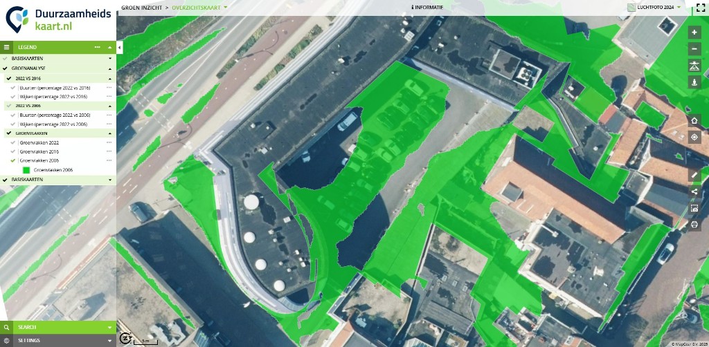
“Our internal specialists will also use the data to decide where new trees are best planted.
The next step is to combine the data with extra map layers so we can prioritise more precisely.
We now know where the green balance is positive or negative, but by also including heat stress and the space taken by other objects, we can get to concrete locations.”
In closing
The collaboration between the Municipality of Hengelo and ESG Maps shows how local green data can become a practical policy tool. The core of the analysis is the balance: making clear how much urban green is added or lost, comparing neighbourhoods, tracking tree canopy cover, and identifying areas that need more attention for climate adaptation and liveability.
This still happens at neighbourhood level, a relatively coarse scale, but the ambition is to grow towards street level. That is where it really becomes clear whether there is enough urban green to reduce heat stress and strengthen liveability. By bringing several data layers together in a visual ESG Maps dashboard, the city can steer green infrastructure with an eye on both past and future.
Hengelo shows how local green data can become a practical policy tool. The same approach can help cities elsewhere compare neighbourhoods, monitor change and build a stronger evidence base for urban greening.
The species management plan (SMP): Mark’s other major challenge
Alongside the urban green analysis, city ecologist Mark Hoksberg has a second major task: in the coming years he will map protected species in Hengelo and Beckum, from house sparrows and swifts to bats, hedgehogs and weasels.
“That is going to be a huge job,” Hoksberg says. “But in the longer term it delivers a lot. Construction projects sometimes stall for years because bats or birds turn up unexpectedly. With the new species management plan (SMP) we will know in advance where protected species live. That way we can protect better and build faster.”
Want to know more? Read the full interview with Mark Hoksberg at 1Twente or visit our ESG Maps article on the species management plan.
Contact
Want to know more?
Questions about our products? Looking for a demo or quote? Fill in the form and we will get back to you.
Fill out the form and we will contact you within 24 hours, or book .