
Without Sustainability Data, Policy Becomes Guesswork
Sustainability data becomes truly valuable when it supports decisions. Discover how municipalities can use maps, dashboards and spatial analysis to identify priorities, monitor progress and strengthen sustainability policy.
Municipalities already have more sustainability data than ever before. Energy consumption, solar installations, insulation, heat stress, green space, mobility and climate risks can all be measured, mapped and monitored. Yet more data does not automatically create better policy. The real challenge is knowing what matters, where it matters and what should happen next. When information is scattered across spreadsheets, dashboards, reports and separate departments, even a simple policy question can become difficult to answer. Teams spend time searching, checking versions and comparing sources instead of acting on what the data is already telling them. That is when sustainability data stops being a resource and starts becoming a burden.
When the data exists, but confidence does not
Most municipalities do not lack information. They lack one clear picture. An energy team may be working with one dataset, climate specialists with another, while policy officers rely on reports that were created months earlier. Each source may be useful on its own, but together they can create uncertainty rather than clarity. Which figures are current? Which neighbourhoods need attention first? Which measures are already working? Can the same evidence be confidently presented to management, the council or residents?
When those questions are difficult to answer, decision-making slows down. A strong sustainability data environment brings information together so teams can spend less time asking, “Which source should we trust?” and more time asking, “What should we do next?”
A spreadsheet can show you the numbers. A map shows you the reality.
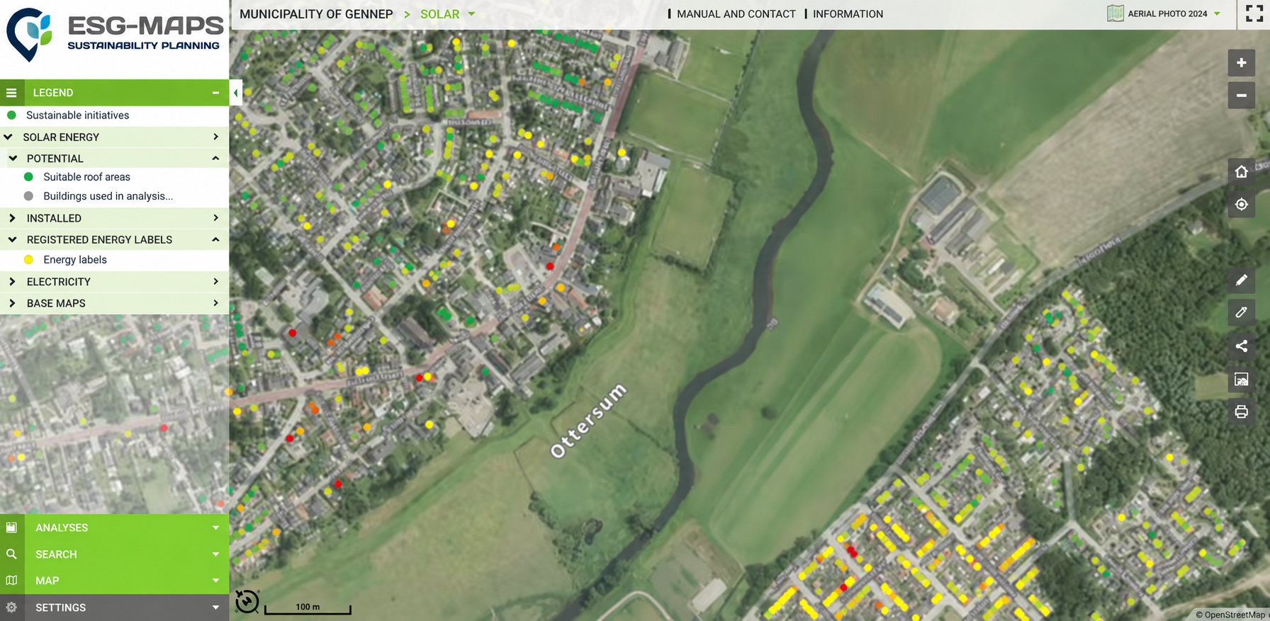
Sustainability challenges are never evenly distributed. One neighbourhood may have high energy consumption and low insulation rates. Another may face serious heat stress with very little green space. A third may have strong rooftop solar potential but limitations elsewhere in the local energy system. A table can show those values, but spatial insight shows how they relate to actual places and communities.
By visualising sustainability data geographically, municipalities can immediately see patterns that are difficult to recognise in separate files and reports. Differences between neighbourhoods become visible, areas that are falling behind stand out, and opportunities that were hidden in rows of data become easier to recognise. That shift matters because policy is ultimately implemented somewhere.
Stop treating every neighbourhood as if it has the same problem
One of the biggest risks in sustainability policy is applying broad measures to highly local challenges. The same intervention will not have the same impact everywhere. A neighbourhood with poor building performance may need a completely different approach from an area struggling with heat, limited shade or low solar adoption.
Without spatial context, priorities can easily be based on assumptions, averages or whichever issue happens to be most visible at the time. Sustainability data helps municipalities see where the need is greatest and where an intervention is most likely to make a meaningful difference. That does not mean data should make the decision. It means decision-makers can start from evidence rather than guesswork.
If you cannot explain the priority, it becomes harder to defend the investment
Every sustainability measure competes for time, budget and political attention. Why should one neighbourhood receive support before another? Why invest in greening here instead of somewhere else? Why focus on insulation, solar, mobility or heat adaptation in a particular area?
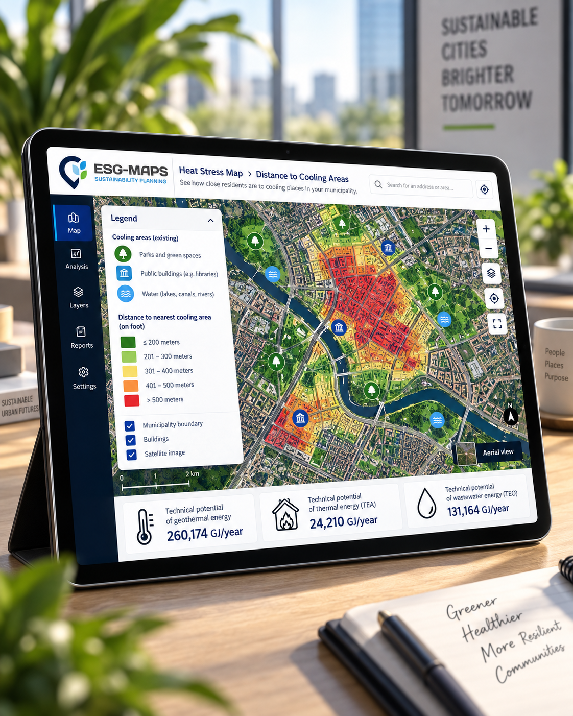
Those choices become much easier to explain when they are backed by visible, location-specific evidence. Maps and dashboards help turn complex analysis into something that can be understood beyond the specialist team. Management can see the pattern, councillors can understand the reasoning, and residents can see why certain areas are being prioritised. That creates more than insight. It creates confidence around the decision.
The goal is not another dashboard
Municipalities already have enough systems that collect and display information. The real value comes when sustainability data becomes part of everyday policy work rather than another dashboard that is opened occasionally and forgotten.
A useful environment should help teams answer real questions: Where is progress slowing down? Which neighbourhoods combine several sustainability challenges? Where are measures having an effect? Which areas need further investigation? Where should limited resources be focused first? When data supports those conversations, it stops being something that is merely reported and becomes something that helps steer.
The most expensive data is the data nobody uses
Municipalities invest significant effort in collecting, purchasing and maintaining information. But when that data stays trapped in separate systems or is too difficult to interpret, much of its potential value is lost. The issue is not whether the dataset exists. The issue is whether someone can use it when a decision needs to be made.
Connecting sustainability data with maps, analysis and reporting helps ensure that information does not simply sit in the background. It becomes accessible to the people who need it and understandable enough to influence policy. That is when data starts earning its place in the organisation.
One shared view can change the entire conversation
When teams work from different datasets, they can easily end up discussing different versions of the same problem. A shared spatial environment creates a common starting point. Energy, climate, mobility, green space and other sustainability themes can be viewed together instead of remaining isolated within separate departments.
This matters because real-world challenges rarely fit neatly inside organisational boundaries. Heat stress may overlap with vulnerable populations. Energy performance may connect with housing quality. Green space may influence both climate resilience and liveability. Seeing those relationships helps teams move from individual policy themes towards a more complete understanding of the area.
Better policy does not always require more data
When uncertainty exists, the instinct is often to gather more information. Sometimes that is necessary, but often municipalities already have enough data to make a better decision. The bigger challenge is connecting what already exists and making it understandable.
Instead of asking, “What else should we measure?”, a more useful question may be, “What is our existing data already trying to tell us?” That shift can save time, reduce duplication and make existing investments in data far more valuable.
From knowing more to acting better
Sustainability policy will always involve complexity. Data cannot remove political choices, budget constraints or competing priorities, but it can make those choices more informed. It can reveal where problems are concentrated, show where progress is happening and help municipalities explain why certain actions are being prioritised.
That is the real purpose of sustainability data: not more dashboards, more reports or more numbers for the sake of numbers, but better visibility, clearer priorities and more confident decisions. ESG Maps helps municipalities bring sustainability data, spatial insight and policy information together in one environment so teams can move from scattered information to actionable insight.
Ready to turn sustainability data into a practical policy tool?