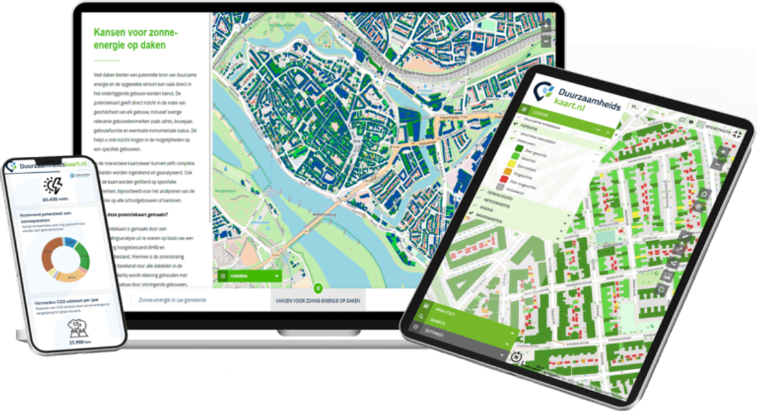


Why Energy Insight Is No Longer a Luxury for Municipalities
Municipalities already have large amounts of energy data. The challenge is turning it into a clear spatial picture that shows where progress is happening, where opportunities remain and where action should come first.
Municipalities are expected to make increasingly complex choices about solar energy, sustainable heat, housing, infrastructure and the wider energy transition. At the same time, much of the information needed to support those decisions already exists. The problem is that it often sits across separate datasets, reports, spreadsheets and systems.
That fragmentation makes a difficult task even harder. Knowing how much renewable energy is being generated is useful, but policymakers also need to know where progress is happening, where potential remains and which neighbourhoods or areas deserve attention next. Energy insight is therefore no longer simply useful background information. It is becoming part of the foundation for effective energy policy.
If you cannot see where the transition is stalling, how can you steer it?
Municipal targets are often discussed at city or regional level, but the energy transition happens location by location. Solar adoption can differ sharply between neighbourhoods, opportunities for sustainable heat depend on local conditions, and building characteristics influence which measures are realistic.
A total figure for the municipality can show whether progress is being made, but it cannot always explain why one area is moving faster than another. Spatial energy insight adds that missing context by connecting energy information to actual buildings, streets, districts and neighbourhoods.
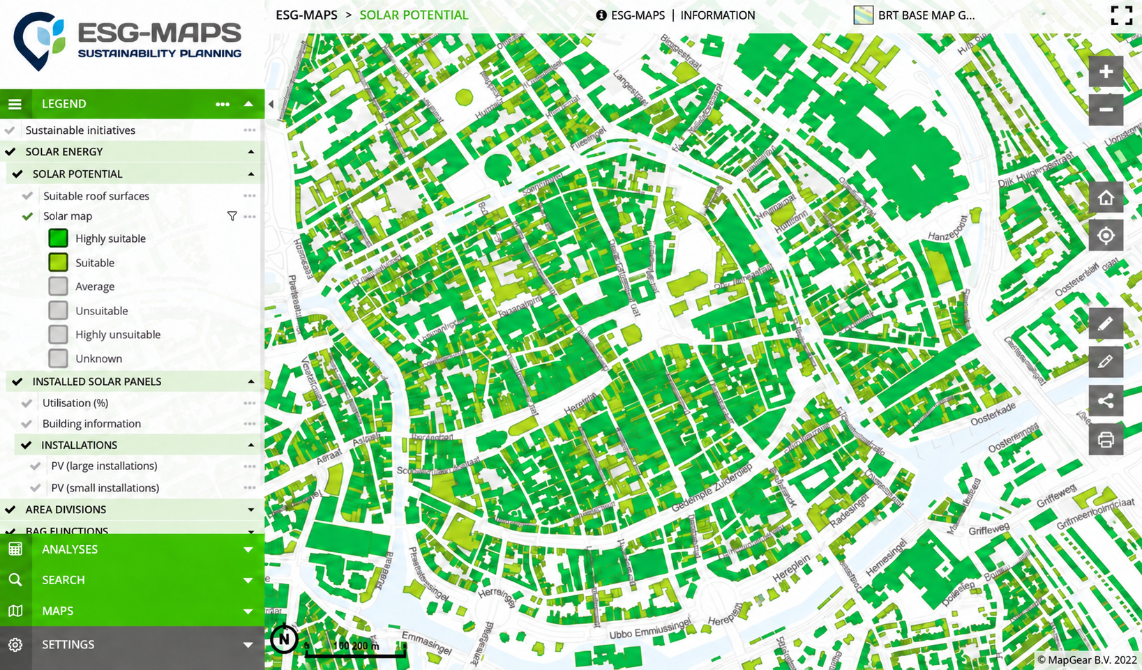
ESG Maps brings sustainability information together spatially and currently supports municipalities with energy and RES applications including solar potential, sustainable heat and regional energy strategy insights.
More energy data will not help if nobody can connect the dots
Municipalities rarely suffer from a complete absence of data. The greater challenge is that each dataset answers only part of the question. Solar potential may sit in one environment, installed capacity in another, while housing, heat and policy information are maintained elsewhere.
Viewed separately, those sources provide information. Viewed together, they can reveal patterns. A neighbourhood with strong rooftop potential but limited uptake suddenly becomes visible as an area worth investigating. Sustainable heat opportunities can be considered alongside local demand. Progress can be compared geographically instead of being reduced to one municipal total.
This is where an energy map becomes more than a visualisation. It becomes a working environment for connecting existing information and turning it into questions policymakers can actually act on. ESG Maps is designed around this principle, bringing energy, climate and sustainability information into one platform with analysis, monitoring and reporting tools.
Every investment needs a reason. Spatial insight helps you defend it.
Energy-transition measures compete for budget, capacity and political attention. That makes prioritisation unavoidable. Why should one neighbourhood receive additional attention? Where should solar initiatives be encouraged? Which areas deserve closer investigation for sustainable heat? Where is progress falling behind expectations?
Those decisions become easier to substantiate when policymakers can connect them to visible spatial evidence. Maps and dashboards allow differences between areas to be compared and give policy teams a clearer basis for explaining priorities to executives, councils, partners and residents.
For solar energy specifically, ESG Maps combines roof potential, installed capacity and progress by area, supporting policy, monitoring and reporting rather than treating the solar map purely as a resident-facing information tool.
The energy transition does not need another dashboard. It needs direction.
A dashboard is valuable only when it helps answer what happens next. Municipalities need more than figures to report at the end of the year. They need an information base that helps them recognise opportunities, follow developments and adjust priorities while the transition is still underway.
That means moving from collecting energy data to using energy insight. Instead of asking where the latest spreadsheet is stored, policy officers should be able to ask which neighbourhoods are falling behind, where renewable-energy potential remains unused and where different measures could reinforce each other.
ESG Maps gives municipalities one central environment for climate, energy, green space and other sustainability themes, with current maps and indicators intended for policy, monitoring and communication.
Energy insight does not make the policy decision for you. It makes the consequences, opportunities and differences between areas easier to see before that decision is made.
The transition is already happening. The real question is whether you can see clearly enough to steer it.
Ready to see where your energy transition needs attention?