

From Sustainability Data to Spatial Decisions: Where Should You Act First?
Sustainability data can show what is happening, but spatial analysis helps reveal where action may matter most. By connecting environmental, social and governance indicators to location, organisations can compare areas, identify overlapping challenges and make priorities easier to explain.
Sustainability teams rarely struggle because they have no data. More often, the challenge is understanding which indicators matter together, where pressures are concentrated and which neighbourhoods, buildings or project areas deserve attention first.
Environmental, social and governance information is often spread across datasets, dashboards and departments. By connecting those indicators geographically, ESG Maps creates a shared spatial view that helps organisations compare areas, reveal overlapping challenges and move from reporting what is happening to deciding where action may have the greatest value.
Sustainability data is everywhere. The hard part is knowing where to act first.
A municipality may already have data on heat stress, energy use, tree coverage, green space, building performance, water risks and project activity. However, viewed separately, each indicator only explains one part of the situation.
Spatial analysis brings those themes together so teams can see where challenges overlap. For example, high heat exposure may coincide with limited tree coverage, while older building stock may overlap with high energy demand. As a result, organisations can identify places where one intervention may support several sustainability objectives at the same time. This changes the conversation from “Which indicator is performing badly?” to “Which areas need our attention most, and why?”
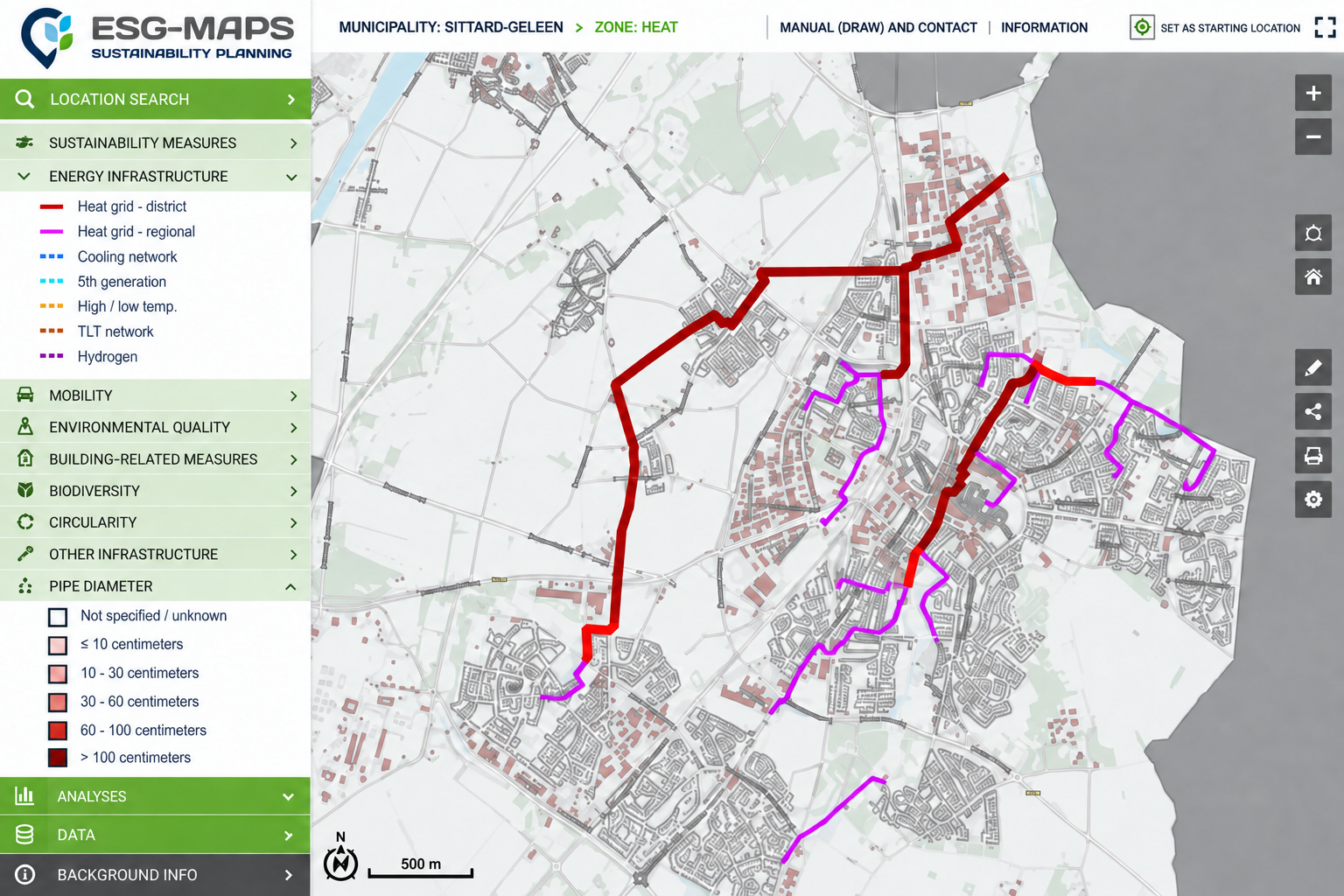
ESG Maps combining sustainability indicators to identify priority areas
A single indicator rarely tells the whole story of a neighbourhood
Environmental performance becomes more meaningful when social context is visible alongside it. Two neighbourhoods may experience similar heat exposure, for example, while differing significantly in access to green space, amenities or other local conditions.
Therefore, combining environmental and social indicators can help teams understand not only where pressures exist, but also how different areas may experience them differently. This provides a stronger basis for comparing priorities and considering whether sustainability benefits and risks are distributed evenly.
Governance data adds another layer. By connecting projects, measures, responsibilities and policy goals to locations, teams can also see where action is already underway, which areas remain underserved and where further coordination or investment may be needed.
The most useful map is the one that helps teams compare choices
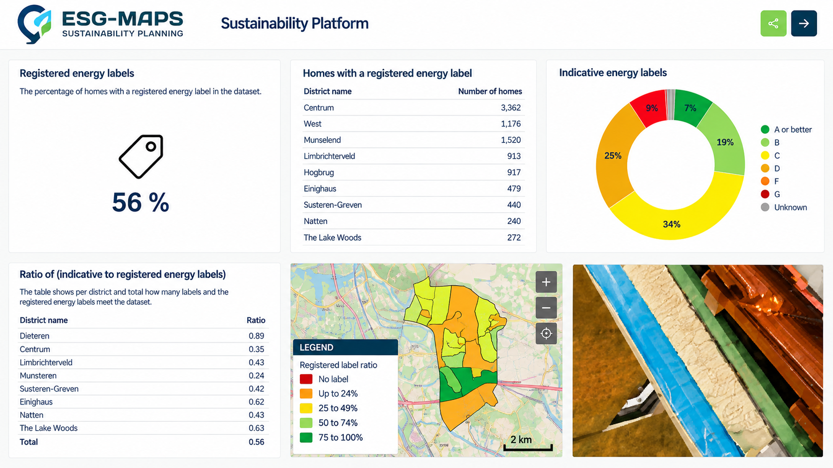
A dashboard becomes more valuable when it does more than display totals. Connecting charts and indicators to geography allows users to move from an organisation-wide overview to specific neighbourhoods, buildings or project areas and investigate why performance differs between them.
In practice, this makes it easier to compare possible interventions. Teams can examine where challenges overlap, where existing projects are already addressing them and where a new measure could complement work that is already planned.
Sustainability programmes also involve multiple departments and external partners. Bringing projects into the same spatial environment can create a shared overview of objectives, locations, status and expected impact. Where public or stakeholder input is needed, MapTalk can add location-based participation so feedback can be connected directly to the areas and measures being discussed.
Spatial insight becomes valuable when it changes what happens next
Sustainability conditions do not remain static. Buildings are renovated, projects are completed, vegetation develops and new climate or social data becomes available. Consequently, priorities that made sense two years ago may need to be reconsidered as circumstances change.
Keeping ESG indicators and projects connected geographically allows organisations to compare developments over time, monitor whether measures are producing the intended results and adjust priorities when new information becomes available. It also makes decisions easier to explain because stakeholders can see where challenges occur, what action is taking place and why certain areas receive attention.
The real value of spatial ESG analysis is therefore not another dashboard or map. It is the ability to turn sustainability data into a clearer answer to a practical question: where should we act next?
See where your sustainability priorities overlap, where action is already happening and where the next intervention could have the greatest impact.